Monday, 31 March 2008

HOLLYWOOD STEPS OUT (1941)


I always loved cartoons with celebrity caricatures. Warner Brothers' "HOLLYWOOD STEPS OUT" is one of the best.

The background art does a beautiful job depicting the glamorous Hollywood nightclub scene at Ciro's, one of Tinseltown's notorious hot spots.

The pan shot of the interior is digitally recreated, giving us a view of the art we never saw in the movie. That's Cary Grant on the far right.

You can find out who all the old movie celebrities are here:

http://classiccartoons.blogspot.com/2006/02/whos-that-guy-hollywood-steps-out.html

More art from this great cartoon will follow...

Saturday, 29 March 2008

The Beautiful Briny, Shimmery Shiny Sea


This fantastic artwork underplayed two dancing fish for mere seconds in the BEAUTIFUL BRINY SEA segment of BEDKNOBS AND BROOMSTICKS.

FIrst up, the featured fish in a screen cap. Remember them swimming by? Below it, my digitally re-created pan Background.

After several hundred backgrounds and blog entires, I'm running out of words! I hate to repeat myself, but...

Truly, the texture and play of light is marvelous.

After doing this for years, every once in a while I am truly amazed at the artwork revealed. This is one of those times. Who would expect such an intriguing piece of art behind this very brief scene? Disney excellence raises the bar again!

Gorgeous!


Here are some more pieces from Italian guest artist Andrea Scipione, wonderful digital re-creations of backgrounds from CINDERELLA. Thank you Andrea for sharing these!

Friday, 28 March 2008

THE LITTLE MERMAID


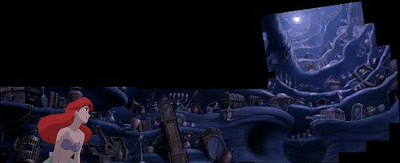
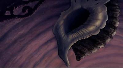
A new guest artist from Italy, Andrea Scipione sent these wonderful digital re-creations of backgrounds from THE LITTLE MERMAID. Thank you Andrea!

This was the last Disney feature to use hand-painted cels.

Enjoy these wonderful B/Gs. Bella!

THREE CABALLEROS


Here are two different treatments of the same street from THE THREE CABALLEROS. The first (like a pop-up book) is very cartoonish. The second is more like a chalk drawing.

Theoretically, they could have used one B/G and zoomed in for a close-up. instead, two B/Gs were painted and the textures are quite different.

This is intriguing to me. How about you?

Thursday, 27 March 2008

POPPINS Returns: English Countryside


With the carousel horses off and running, we see some beautiful English countryside.

Wednesday, 26 March 2008

PETER PAN - London skies at night


Wonderful reconstructed B/Gs from our guest artist Andrea Giglio. Magnifico!

Monday, 24 March 2008

Donald In Mathmagic Land


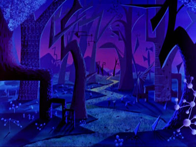
These very modern B/Gs were created for "Donald In Mathmagic Land."

The eye-popping colors and imaginative designs make these especially attractive, don't you think?

PETER PAN


Guest artist Andrea Giglio recently sent a huge folder of recreated artwork from PETER PAN. Thank you, Andrea!

Here is the first set from Andrea's beautiful recreations, with many more to come.

Our sincere appreciation for sharing!

Saturday, 22 March 2008

HOW IT'S DONE: Re-creating Digital B/Gs


I frequently get questions about how I actually recreate these backgrounds. Today I was working on refining a B/G for one of my Mary Poppins Penguin cels, and I thought I'd show the process, step by step. There were actually eleven layers. Here I am sharing the major steps only.

On rare occasions, a background will appear for a frame or two by itself, before a character enters or leaves a scene. They are the exception, however. Usually the animated character(s) move all over the scene.

So then, the concept is (with DVD screen caps) to look for the places where the character is NOT. I layer these in Photoshop like a jigsaw puzzle, blending the seams where the pieces meet, and eventually I have a completed background. As an example, here is a montage of just a few of the background fragments this POPPINS piece required.


I darkened the underlying original frame cap, so the background pieces really stand out. This shows exactly how the process works. You can clearly see in each successive frame a different piece of the background, with which I can cover the penguins, thus re-creating the entire original background.

It's a painstaking process. This one took about five hours. I was lucky here, the colors matched perfectly frame to frame. The really tough ones are long pans where the various sections' colors actually change hue, brightness and/or tint. All this can be adjusted, but it compounds the complexity of the process exponentially.

Since this POPPINS setup has people in it, there was one more step than usual: they had to be digitally erased on each layer so their original key frame position remained.

Remember, you can always click on the images to see a larger version.

This first image shows about half of the left penguin removed:

A few layers later, most of the left penguin is removed:

Again, a few layers later, most of both penguins have been eliminated:

Here's the finished background. Notice there is a slight artifact of the left penguin's flipper on Mary's dress. This is good - it will help with exact placement of the cel overlay. It will disappear underneath the cel, as will all the re-created B/G art. But at least we got to see it, first!

And just for fun, I took an earlier view of Mary turned toward Bert, and overlaid that, so you could see a finished image of Bert and Mary at tea, with the table set, no penguins, no flipper artifacts, and a beautiful unobstructed view of the background art.

"Ain't it a beautiful day?"

Friday, 21 March 2008

Don't miss "ART CORNER RESTORATIONS!"

There's a new post today of Art Corner animation art restorations on our companion blog, CELS AND SETUPS.

Featured are original Disney production cels of Donald Duck and Peg Leg Pete.

For some reason I am having problems with inserting the link. Please copy this URL,paste it into your browser, and away you'll go!

http://celsandsetups.blogspot.com/2008/03/art-corner-restoration-pete-donald.html

LILO AND STITCH Pan Background


Here I've recreated an entire pan B/G, and you'll recognize the far left and right elements from yesterday's post.

Don't forget to click on it to see the larger version.

Ain't technology grand??!!!

Thursday, 20 March 2008

LILO AND STITCH


This contemporary Disney film was one of the last successful "traditional" Disney animated features. These first few backgrounds show a definite stylistic link to the classic Disney style. There are definite tropical echoes of "Hawaiian Holiday" (1937) and "The Jungle Book" (1967) in the artwork. The lush, native Hawaiian landscapes are beautifully rendered, immediately invoking the warmth and charm of the Polynesian islands.

Saturday, 15 March 2008

TREES from MELODY TIME


Color me sentimental and old-fashioned... but this segment moves me very deeply. The classic Joyce Kilmer poem TREES received a beautiful musical setting by composer Oscar Rasbach. From that, Disney's version received an orchestration which was incredibly lush, with a storm segment added in the middle. The final touch was beautiful vocals by "Fred Waring and the Pennsylvanians." Probably most blog readers are too young to even recognize that name. But as a very small child in the 60s, my parents took me to a Fred Waring concert. Mr. Waring was a great vocal conductor, and "the Pennsylvanians" were his singers, his choir.

Rarely will you hear a choir sing with such intensity, nuance and feeling. Nearly every word receives special phrasing.

These images are from the background art in TREES by Mssr's Disney and Waring.

In a world where much of what passes for "music" is angry, lacking in melody, and colorless, TREES is refreshing in its unbridled nostalgia.

Once upon a time, listeners actually embraced beautiful words and melodies, thrilled to lush harmonies, and music and art strived to move the heart.

It was a simpler time. And that, I think, was a very good thing.

Bumble Boogie from MELODY TIME


Here is the title card and two very stylish B/Gs from the BUMBLE BOOGIE sequence in MELODY TIME. Terrific, eh?

Miscellaneous info...

Don't miss Cruella, Donald Duck and Mary Poppins Penguins on our sister blog, Cels and Setups:

http://celsandsetups.blogspot.com

Also, remember you can click on any image to reveal a larger version.

And... we love your comments. In particular, your observations about a particular piece of art.

Have fun looking around, and have great weekend!

Friday, 14 March 2008

Merlin's Door


I love the B/Gs from THE SWORD IN THE STONE. Being a "creative" (that's a noun) I find myself occasionally in spaces reminiscent of these, surrounded with things I love - books, art, all sorts of interesting things. No science projects!

It's a bit messy at times, to my wife's chagrin, but yet it has a sense of order... to me, anyway.

I guess that reason is as good as any, as to why I love these B/Gs!

Back to Baia!